The weather is finally warmer, the birds are chirping and flowers are blooming. It’s a time of new beginnings and a perfect time to update your website visuals. Bring a fresh look to your website while portraying your brand message.
Think about how many different websites the average person visits each day, week or month. The competition is fierce! That’s why it’s important to invest some time and money into getting the right shots that will tell your brand story.
We’ve been busy the last little while, helping different businesses breathe new life into their websites. See below for the different ways we’ve helped our clients create effective visuals.

This is an example of a staff photo we shot for Brigholme. Notice the furniture and Brigholme brochures which are part of the shot.
Brigholme’s staff photos, on their original about us page, had been rushed as they were eager to launch their site. The lighting was unflattering so they had to go with black and white photos. They were ready to jazz it up and came to the right place.
Brigholme specializes in business furniture and facility services, so we wanted to feature their products in the shots. We had the staff photographed at their head office in front of the great products they sell. For the staff that missed our shoot date, we were able to photograph them in our studio. We recreated their office environment and used the same shooting technique as the original photos, so that everything would blend together nicely. See the photos here.

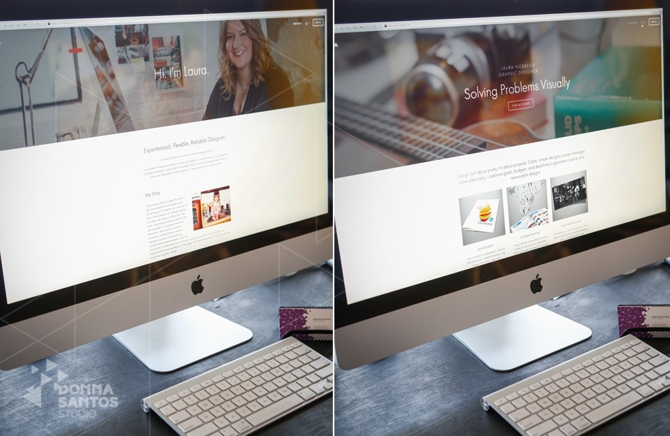
Laura’s website is a great example of professional photos being used as a website banner. The photos also add a personal touch to her website.
Laura is a graphic designer who was launching her own website. She wanted photographs that were a true reflection of herself and her work. During the consultation, Donna found out that Laura is also a photographer and plays the ukulele! Laura was encouraged to bring these personal props and more to her shoot.
Using these props and our studio as a blank canvas, we were able to create a personal and modern work environment to be used in our portraits of Laura.
The results were perfect and Laura incorporated them into her website in such a beautiful way. The majority of the photos were used as banners for sections of her website. Check them out here.

This is a great shot of Irene in her element. It’s also a great type of photo to use as a banner on your website or social media.
Irene Bakaric, Principal at MediaPrep wanted to update her website photos and have some photos for her social media profiles. Since she works in PR the shots had to convey her professionalism and confidence.
During the consultation, Donna and Irene decided to match Irene’s wardrobe with the colours on her website. They also took some wide shots so that Irene could use them for her website banner as well as her facebook cover picture.
These are just a few examples of what you can do to add some visual appeal to your website. Scroll down to sign up for our newsletter to keep updated on our future posts. To get started on revamping your website contact us here.
Posted By
Marisa Dominutti
Categories
Corporate Media, Portrait Photography
Tags
how to, professional photos, website ideas, website photos